End-to-end redesign of a legacy-heavy fintech dashboard, transforming an overloaded interface into a structured, decision-focused experience built around progressive disclosure, clear hierarchy, and action-first financial workflows.
Sector
Fintech, B2B/B2C
Project team
Squad: Product, Design, Engineers, QA, Data, Compliance
Role
Lead product designer
Timeline
Oct 2025 - Ongoing
The problem
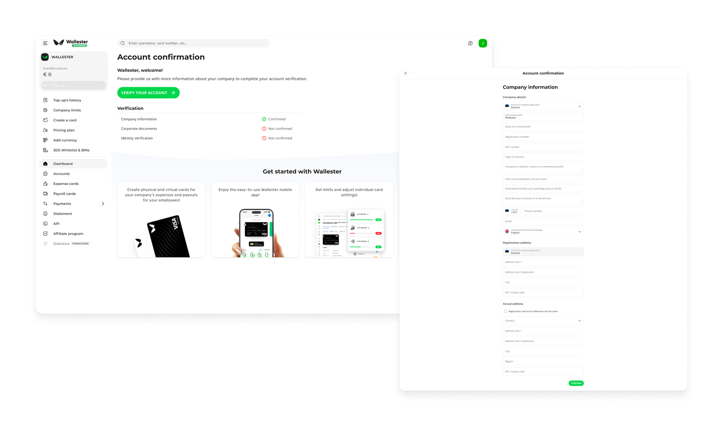
Key challenges included:
Important financial actions buried under secondary information
Inconsistent UI patterns across different sections of the dashboard
Lack of clear hierarchy in financial data presentation
Overloaded interface leading to high cognitive effort
Low discoverability of advanced features and tools
As a result, users often struggled to confidently navigate the product, especially when managing time-sensitive financial operations.
The dashboard was still functional — but it was no longer helping users think clearly.
Over time, Wallester’s client dashboard had evolved into a dense, legacy-heavy product. New features were added on top of existing ones, resulting in a fragmented experience with inconsistent patterns, unclear hierarchy, and increasing cognitive load.
For CFOs and business owners , who rely on speed and clarity, this meant critical actions were often hard to find, and the overall experience felt overwhelming rather than supportive.
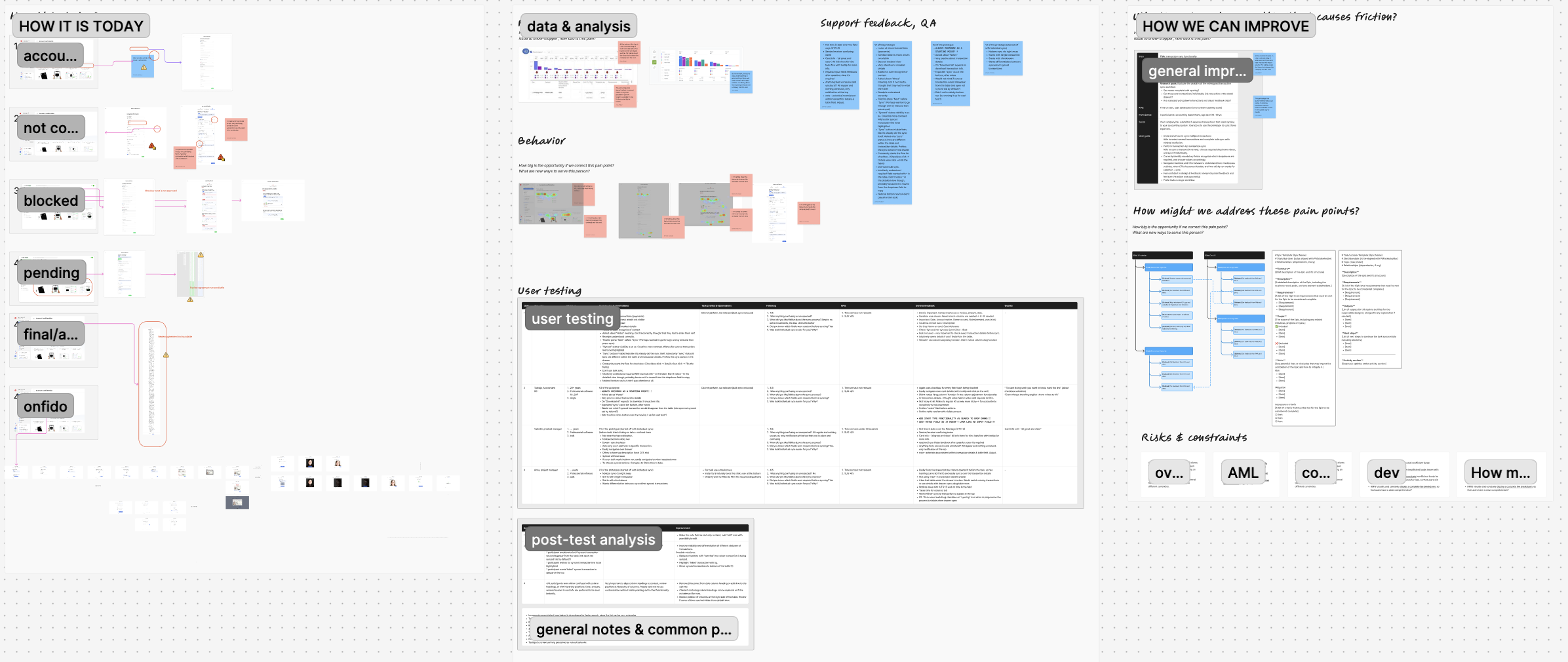
Discovery & Research
Rather than treating the redesign as a final delivery, we positioned it as an evolving system:
Continuous monitoring of usage patterns after rollout
Iterative refinement of components based on real-world behavior
Adjustments to flows and hierarchy based on feedback signals
Alignment of future roadmap decisions with validated insights
This creates a long-term feedback loop between design, product, and real user behavior, ensuring the system continues to evolve with user needs.
To understand where friction originated, I combined qualitative and quantitative inputs across product, support, and compliance teams.
Rather than looking at isolated issues, the goal was to identify patterns across the entire user journey.
Key insights
What emerged was not a single UX issue, but a system-level clarity problem:
Users were consistently overwhelmed by information density
Visual hierarchy did not reflect real task importance
Key actions were buried within secondary or legacy navigation patterns
Advanced features had low discoverability despite high business value
Users relied heavily on support to complete routine tasks
One recurring pattern stood out: users weren’t struggling because the product lacked functionality — they were struggling because they couldn’t see what mattered most at the right moment.
We explored multiple data sources:
Funnel analytics to identify drop-off points across key dashboard flows
Heatmaps and usage data to understand interaction behavior and attention patterns
Support tickets analysis to surface recurring user confusion themes
Direct interviews with CFOs, business owners & accountants
Benchmarking against modern fintech dashboard experiences
Direct & indirect competitors, including feature sets, user flows, target audiences, and brand positioning
Strategy and key improvements
Concept direction & high-fidelity alignment
After completing the benchmarking and competitive analysis, a clear pattern emerged: most fintech dashboards were visually polished, but structurally very similar.
Competitors were converging around the same interface logic — similar layouts, similar feature sets, and only marginal UX differentiation. While the UI quality was high across the market, the experiences lacked true intuitiveness and flexibility.
This led to a key realization:
Better UI wasn’t enough — we needed a fundamentally more intuitive system with a near-zero learning curve.
New interaction model
Instead of iterating on existing fintech patterns, we explored inspiration from consumer products known for intuitive, behavior-driven interfaces:
Spotify → draggable, adaptable content and personalization through interaction
Apple → modular widgets that users can arrange based on their priorities
YouTube → persistent minimized states with live contextual data
The idea was to move from static dashboards to a living, adaptable system where users could shape their own experience based on intent and frequency of use.
A key requirement from the beginning was scalability — the system needed to work not only for our core product, but also across white-label implementations with different client needs.
High-Fidelity Concept, Alignment & Roadmap
After alignment and approval, we defined a comprehensive product roadmap tied directly to the evolution of a scalable design system.
This made sure that:
Each release followed consistent system logic
Design system and product development evolved in parallel
Dependencies across UX, engineering, and compliance were mapped
The transition could be delivered incrementally without disrupting existing users
This created a clear path from concept to execution — turning the redesign into a structured product transformation built for long-term scalability and white-label adaptability.
Controlled migration strategy
Instead of forcing a full redesign at once, we ensured:
Old and new systems could coexist safely
Changes were introduced in familiar contexts first
High-usage flows were migrated last to reduce risk
Users experienced continuity rather than disruption
This approach made the transition feel evolutionary, not abrupt, while still steadily moving the product toward the new system direction.
Qualitative feedback loops
To complement behavioral data, we planned ongoing user validation through:
Post-release interviews with finance managers and business owners
In-product micro-surveys focused on clarity, trust, and ease of use
Continuous analysis of support tickets related to navigation and workflows
Feedback sessions with Customer Support and Compliance teams
This ensures we capture not only what users do, but also how they perceive the new experience.
We translated the new direction into a high-fidelity concept layer, focusing on real interaction patterns rather than abstract wireframes.
The goal was to validate the new interaction model early and align stakeholders and the board on a shared product vision.
We used this phase to:
Validate the new interaction paradigm
Align stakeholders and leadership on product direction
Demonstrate a modular, intent-driven system in real use cases
Shift discussions from UI design to system behavior and user experience
This reframed conversations from “what does it look like?” to “how does it work for users?”
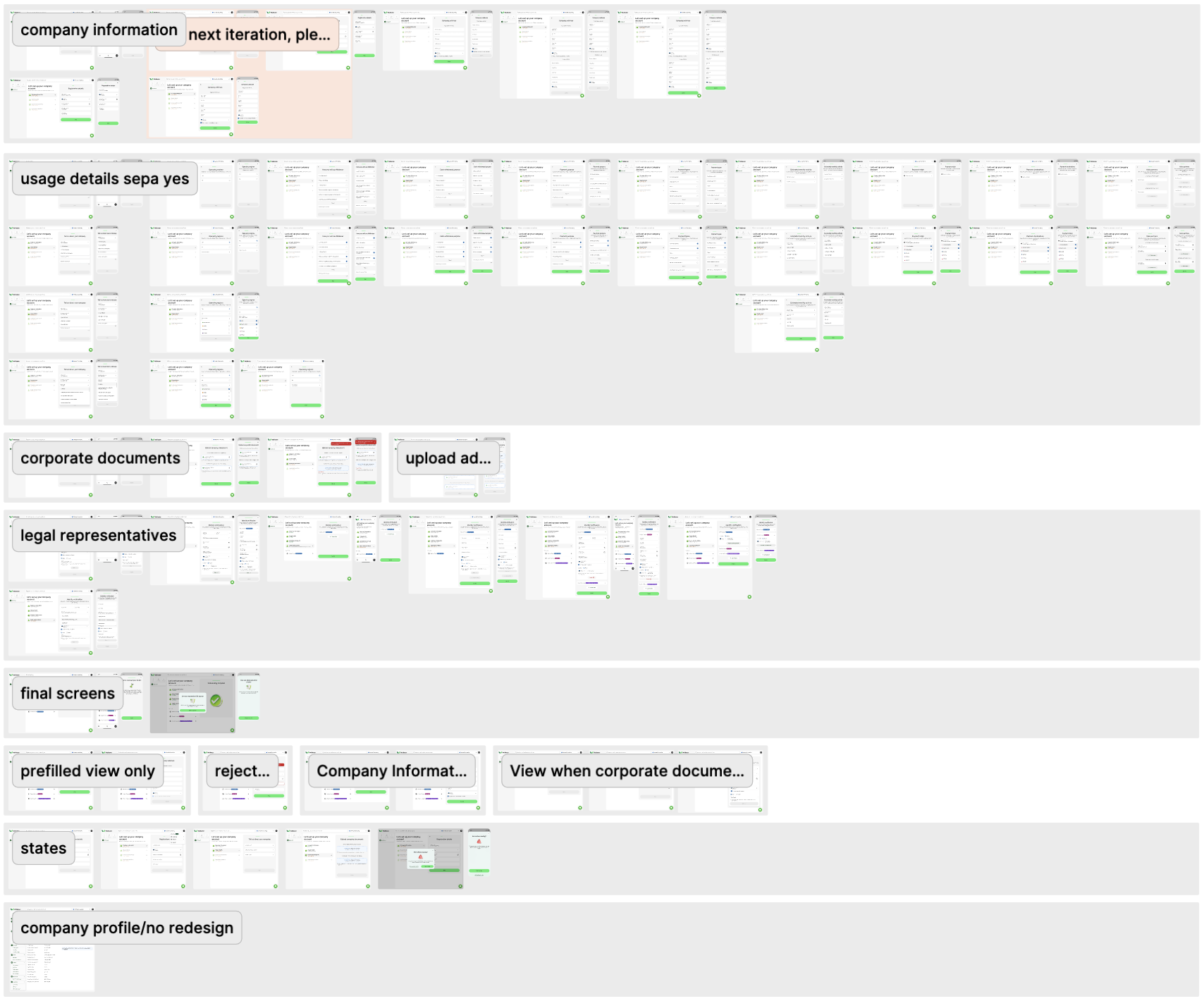
Rollout Strategy & Transition Approach
Before introducing the new system, we mapped the existing product flows in detail to understand dependencies, user paths, and high-risk areas of change.
Given the scale of the redesign and the fact that Wallester is a live fintech product, a full “big bang” release was not an option. The goal was to ensure a low-risk, gradual transition with minimal disruption to active users.
We defined a phased rollout strategy focused on progressive system adoption rather than full replacement.
Phased implementation approach
We introduced the new design system incrementally, starting from foundational and low-risk surfaces:
First, redesigned the global structure (side navigation and top navigation)
Then evolved the dashboard and widget system as the core user entry point
Introduced new features directly in the new system design
Kept legacy pages active, updating only type, spacing, and core visual tokens (fonts, colors) for partial consistency
This allowed users to gradually adapt to the new experience without cognitive overload or breaking existing mental models.
Measurement & Validation
To ensure the redesign delivers meaningful product impact beyond visual and structural improvements, we defined a planned framework for tracking success across both behavioral data and user feedback.
Quantitative signals
We aligned with Product and Data teams to track key metrics post-release, including:
Task completion time across core dashboard workflows
Adoption of newly surfaced features and widgets
Reduction in navigation friction (e.g., backtracking, repeated clicks)
Drop-off points in high-frequency financial journeys
Engagement with contextual and intent-based actions
These metrics will help validate whether the shift toward progressive disclosure and intent-driven navigation improves real user efficiency.